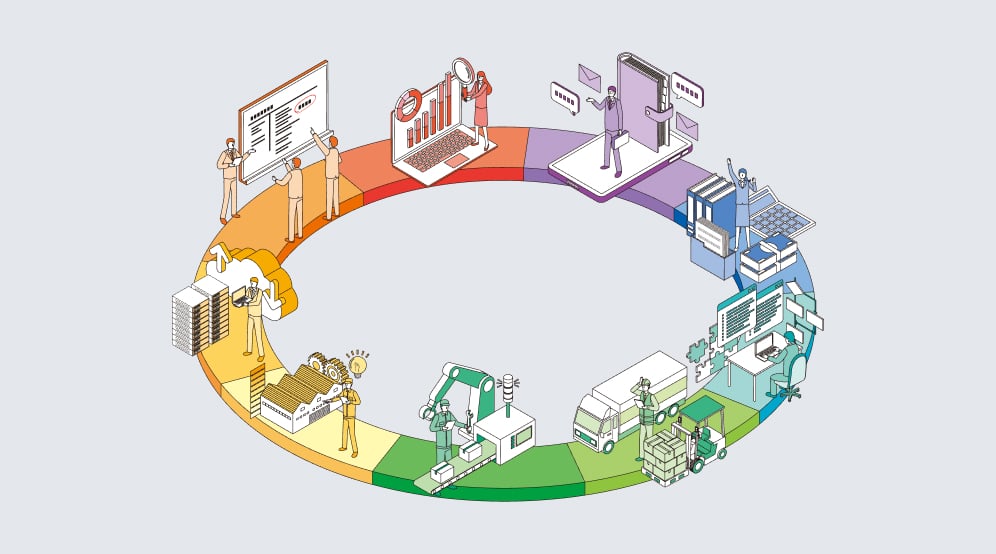
If you’re like most technology companies, you’re swimming in a sea of Big Data. Within that ocean are thousands of rich, valuable insights you need to share with multiple audiences. But your challenge is corralling all of that data into meaningful messages and memorable take-aways.
There is a general assumption data-driven marketing is easy. After all, you just slap some numbers into a chart or graph, right?
Not so fast. It’s that kind of thinking that gave us the word “junkchart.” These are charts and graphs that distract viewers from the intended message with extraneous information. While they may look interesting, they either confuse the message or misinterpret the data. Or both.
Author Steven Few, in Show Me the Numbers, said the skills required for more effectively displaying information are not intuitive and rely largely on principles that must be learned.
While you probably don’t have time to get a degree in data visualization, you can still employ the principles of clear, impactful, data-driven communication. Just think in terms of wearing six hats throughout your process to pinpoint exactly what you want to say, identify your target audience, find the story behind the data, prepare the data, determine how your audience will process the data, and bring the data to life in ways your target audience can understand.
To communicate amazing insights gathered from your technology company’s data, don these six hats: architect, marketer, journalist, data scientist, cognitive scientist and graphic designer.
As the architect of the project, you’ll take a leadership role. You’ll choose the data you want to communicate, create the analytical direction, set the tone, establish the parameters and oversee the process.
Wear a marketing hat to pinpoint exactly whom you are communicating to and what insight the target audience should gain from your data-driven communication.
Is your audience industry analysts, customers, prospects, the media, partners or your employees? Every audience will have a different need for your data.
There are four basic types of audiences to consider for data-driven messages:
Audiences are more receptive to communication if it’s framed in a narrative or story. Put on a journalist’s hat to find a story to communicate your data
Senior Advisor to Deloitte Analytics, Thomas H. Davenport, identified four key dimensions of stories to tell with data:
Analytical stories can be about the past, present, or future.
Does your data tell a what, why or how to address the issue story?
There is a depth dimension to analytical stories.
A central challenge in visualization is creating an effective layout. Put on a data scientist hat to choose your data’s ideal presentation style. There are the four basic options: pie charts, bar graphs, line graphs and maps. But there are other sophisticated choices, too.
In 2010, three scientists at Stanford University created a list of techniques for visualizing and interacting with diverse sets of data, which they called the “visualization zoo.” They organized data-driven visuals into four categories: time-series, statistical distribution, maps and hierarchies.
Cognitive scientists understand the principles of perceptual organization. These mental shortcuts help minimize visual overload and maximize information impact.
Wear a cognitive scientist’s hat to present your data in ways that exploit our visual perception abilities in order to amplify cognition.
Gestalt psychologists have developed a set of principles to explain people’s innate perceptual organization. These principles are often referred to as the “laws of perceptual organization.” They include:
Graphic designers think in terms of shapes, patterns, white space and colors. Wear this hat to ensure your data-driven visuals balance the form and function of your data, while highlighting your key message and achieving your intended communication purpose.
To think like a designer, consider these elements of great design:
This infographic, created by Under Armour, an athletic apparel and digital fitness company, uses data from its popular MapMyFitness app that beautifully illustrates the power of these six steps.
Click to see full infographic
Clearly an architect (or architect team) decided what data-driven message the company wanted to communicate. The target audience was the company’s own sales team — giving them valuable consumer facts to use in the field. The many data points tell the story of MapMyFitness users’ active lifestyles. At the data scientist phase, Under Armour decided to display the data as primarily percentage comparisons. Using cognitive science, the technology company applied several Gestalt principles, such as proximity and similarity. And, finally, the company rendered the data into an elegantly designed graphic that communicates a lot of data clearly without clutter.
Walking through these six steps to communicate your high-impact data may seem daunting, but it’s worth the effort. Making sure your targeted audiences understand the full depth of your messages will have long-term benefits. You’ll be better able to share important information, impress customers and partners, win business, and make smarter data-driven business decisions.
Karen Taylor is a professional freelance content marketing writer with experience writing for over 100 companies and publications. Her experience includes the full range of content marketing projects — from blogs, to white papers, to ebooks. She has a particular knack for creating content that clarifies and strengthens a company’s marketing message, and delivers optimum impact and maximum results. Learn more at KarenTaylorWrits.com.