
Website design trends continue to evolve, but the ultimate goal of creating the best possible experience for the user really hasn’t changed. We’ve just gotten better at reaching users where they are, addressing their needs and making websites more accessible for everyone.
Here are the hottest website design trends in 2023 that we expect will stand the test of time.
10 Hot Website Design Trends
1. Mobile-First Website Design
The idea of mobile-first website design isn’t new, but it has become a top priority as a fundamental SEO attribute. We can safely call this a slow-burning website design trend.
Since 2019, Google has used mobile-first indexing for all new websites, meaning the search engine crawls the mobile version of your site instead of the desktop version. If your website isn’t using mobile-first design, it will be harder for people to find it.
Designing for mobile is still critical for the user experience, too.
The number of people who made purchases from their mobile phones (known as mcommerce) increased by 15% from 2020 to 2021, according to research from eMarketer. In the next five years, eMarketer predicts mobile will be consumers’ preferred channel for online shopping. Mobile-friendly content can speed up purchasing decisions by up to 20%, according to BCG research, shortening the sales cycle by an average of 35 days.
Here are a few best practices to remember for mobile-first website design:
- Consider the visual hierarchy and how information and images will stack on a mobile device first, then apply that to your desktop design
- Use AMP functionality where it makes sense, such as on blog posts or pages with a lot of content
- Consider adding a clickable table of contents that allows the user to easily jump to the section that’s most relevant to them
- Use expandable (accordion) sections for large blocks of text (such as FAQs)
- Use call-to-action buttons with enough color contrast to easily stand out
- Reduce the number of pop-up forms, and ensure any you do use are easily clickable
2. Minimalist Design
Apple is a frequently cited standard for minimalist design, and it’s easy to see why. Their website highlights large product imagery with just a few words of supporting copy and clear calls to action. When you land on Apple’s website, you immediately see the iPhone 14 Pro and you’re invited to learn more about it or buy it before you do anything else.
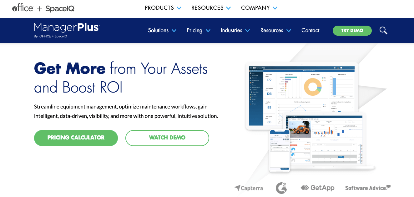
In recent years, B2B companies have implemented many of the same website design principles, too. Websites like Slack and ManagerPlus have a similarly minimalist appearance, with a flat backdrop, a short, prominent statement in the hero area and some basic icons or screenshots of the interface.
3. Using Video to Support the Sales Process
Many B2B products or services are difficult to explain with a few words and a single image. Users need to know more about how the solution will help them work smarter, maintain security or engage employees. Video is a powerful interactive website design element that gives users a clear understanding of what you have to offer and how it works. It's easy to see (literally) why this is a website design trend that will last.
Overview videos have become an important first step in the sales process for many companies and are great to include on a homepage. These videos should be short and sweet — no more than a minute or two — and further elaborate on your value proposition by offering a brief explanation of why you exist, what you do and how it benefits your customers.
Other videos to consider including on your website:
- More detailed explainer videos on individual products and service pages
- A company culture video on your About Us or Careers page
- A short introduction to someone on your sales team on your Contact Us page
In a recent research report from Wyzowl, 87% of marketers said they saw a positive return on investment from video marketing.
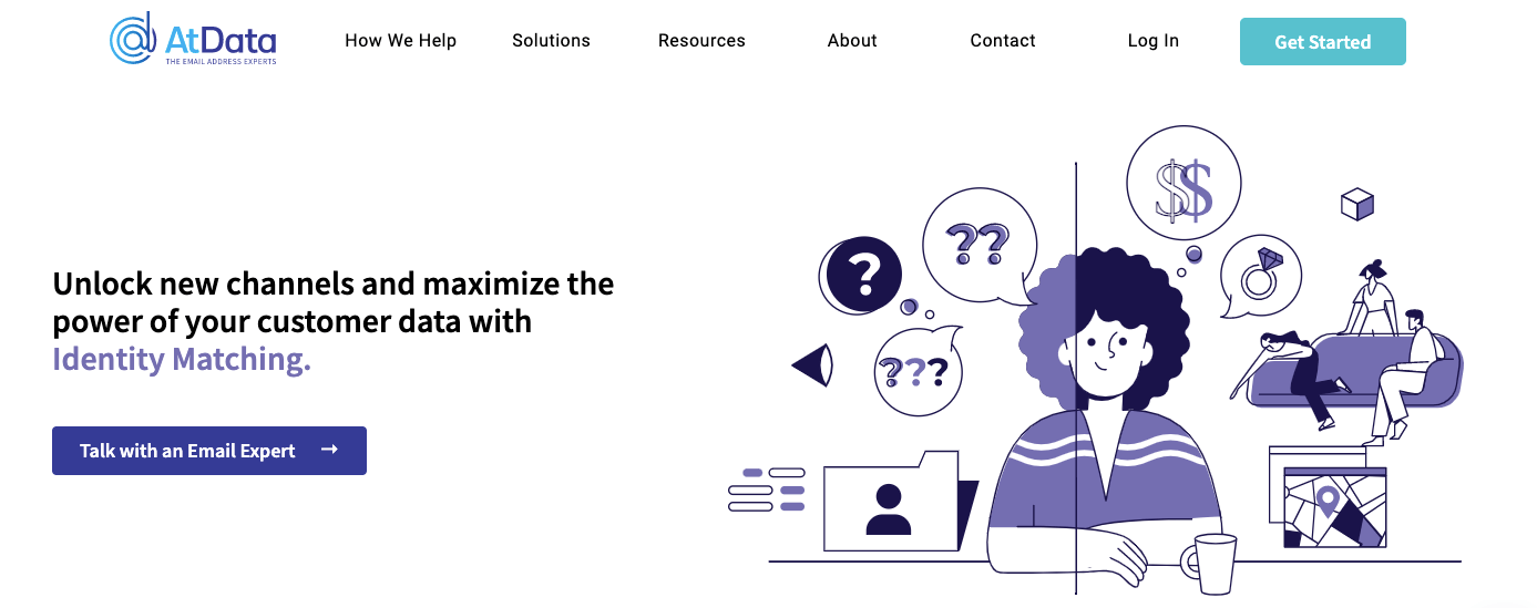
4. Custom Graphics and Animation
Video marketing works so well because our brains are wired for visual content.
That’s why another enduring website design trend is using custom graphics and animation. These elements can help bring your website to life and support your overall brand experience.
5. Gradients in Website Design
You’ve probably seen a lot of gradients used in website design over the years, but this is one trend that isn’t likely to fade anytime soon. Gradients are gradual transitions from one color to another. You can use them to evoke feelings of calm and comfort, familiarity, or ease. They also tend to make your website design flow together as a user scrolls down the page.
6. Gender-Neutral Webpage Design
Language and design evolve alongside culture. As more people identify as transgender, non-binary, non-conforming or gender fluid, we’re seeing more inclusive website design elements. That includes moving away from traditionally “masculine” or “feminine” color schemes or avatars and using gender-neutral pronouns in website copy.
The House of LR&C is a good example. The clothing retailer has an extensive line of inclusive styles and sizes, and its website supports its mission. It uses a neutral color scheme, diversity in its images and inclusive language.
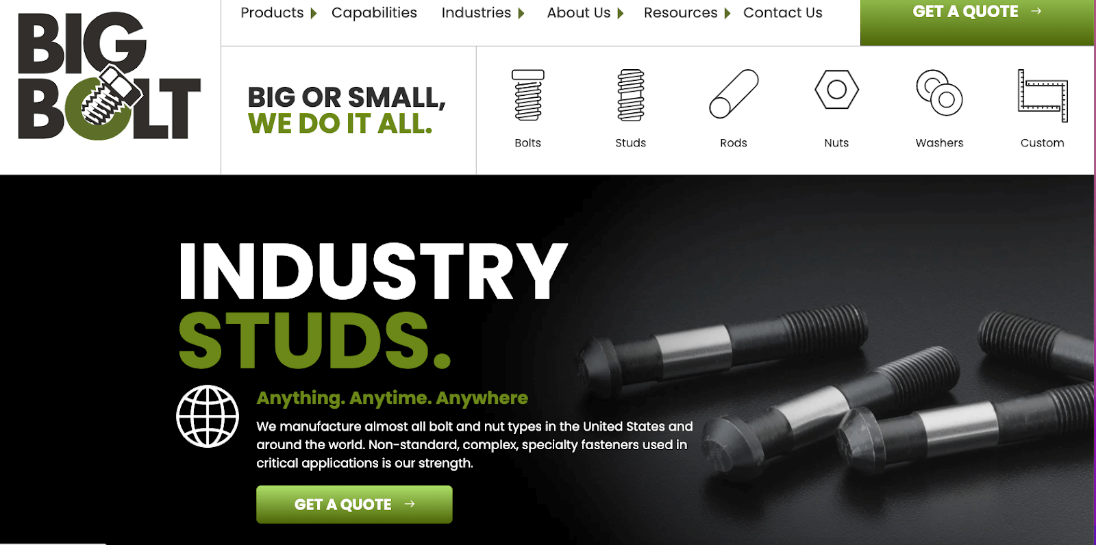
7. Large Typography
Big, bold typography makes a strong statement. The Big Bolt website illustrates this perfectly. This website design trend is especially appealing for manufacturers, but it could work in almost any industry.
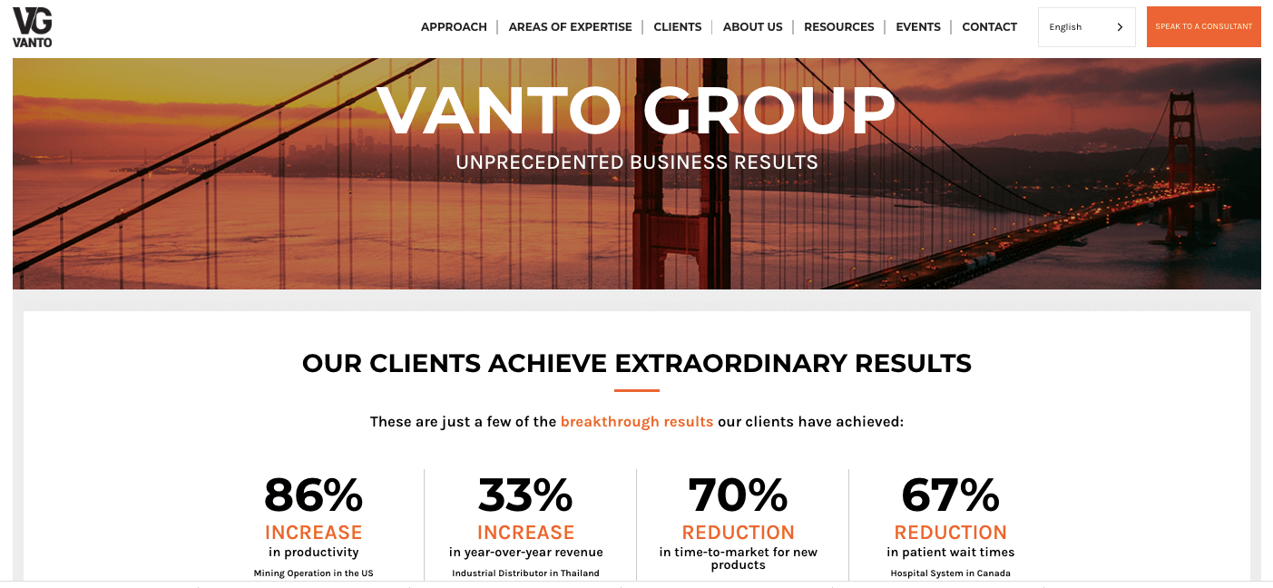
8. Visible Borders
Visible borders help segment information and make it easier to find. You can use them to organize your navigation, make specific products or applications stand out, and more. There are many different types of borders you can create using CSS, including:
- Solid borders
- Borders with dashes or dots
- Borders with grooves, ridges, insets or outsets
Here’s a great example of a website using visible borders.
9. Micro Interactions
Micro interactions create a more engaging user experience on your website. A few examples are “like” buttons on social media platforms, swipe functionality or animated graphics that tell you where you are in the process, such as the rabbit in the Hopper app who appears while you’re waiting to get the best deals on flights.
These elements guide the user through your site, give them opportunities to interact and provide them with valuable information in an instant.
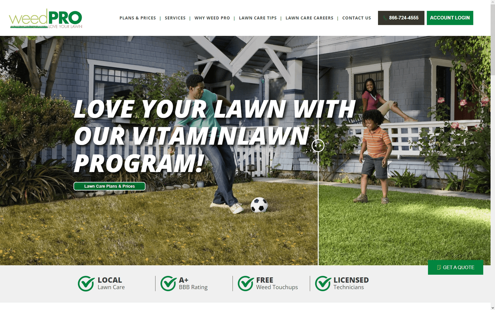
Lawn care company Weed Pro uses a slider that shows a lawn before and after treatment. It’s just a filter, but it’s a powerful visual of how bright and beautiful your yard could look with the proper maintenance measures in place.
10. Accessible Website Design
Accessible website design is essential to provide a good user experience for everyone, including people with visual or hearing impairments and those with learning disorders, such as dyslexia.
This isn’t a trend, but an important factor all brands should consider in the same way that they think about mobile-first website design.
The Web Content Accessibility Guidelines (WCAG) are extensive, but a few key points include:
- Using large, easy-to-read font (at least 16 px or larger) and lines at least 1 ½ spaces apart
- Avoiding long blocks of text and using short paragraphs or bulleted lists when possible
- Using colors with enough contrast for call-to-action buttons and other clickable areas
- Including alt text on all images
- Using captions for all videos
Paying attention to these important details will ensure you aren’t unintentionally excluding anyone from finding the information they need on your website.
Implement These Website Design Trends
Some website design trends come and go, but great user experience is timeless. Knowing how to properly incorporate certain design elements without negatively impacting UX, SEO or page speed requires a specialized skill set and experience.
Our team at Kuno Creative has been involved in the design and development of websites since 2000. We have expertise throughout the process, as well as in managing the intricacies of website migrations, workflows and more.
We also have experience designing websites for a variety of different industries, including technology and software, healthcare, manufacturing and professional services.
Take a closer look at some of our website design examples and contact us anytime to discuss how we can help you achieve the right balance between designing for search engines and designing for people.