


Most of us will admit (begrudgingly or not) that we are somewhat addicted to our phones. In fact, people spend nearly four hours per day scrolling, texting and interacting on the small screen. There is a huge shift in the way digital media is accessed and digital content is consumed — from laptops and desktops to mobile devices — yes, even in the B2B realm.
A report from BCG had some incredible findings on the influence that mobile marketing has in B2B:
- 70% of B2B customers have increased their mobile usage, particularly for searches and research.
- 60% have used their mobile device to help them make a purchasing decision for their business
- Targeting customers with mobile-friendly content can speed up their purchase decision by 20% and shorten your sales cycle by 35 days on average.
And just in case you need one more reason, Google enabled mobile-first indexing by default for all new websites, on July 1. It had already started to transition existing websites to mobile-first, and you encounter problems getting your site indexed and ranked if it isn’t mobile-friendly.
B2B companies that fail to optimize their websites and content for mobile consumers are going to miss out on a lot of lead generation and conversion opportunities in the near future. Creating a truly mobile-first experience requires a whole lot more than just creating responsive websites.
Mobile-First Experience: Getting Started
Start with Small-Screen Friendly Blogs
Company blogs play an important role in the B2B customer journey with 71% of buyers stating this content helped them make a final purchasing decision. However, the way your target audience is consuming content on the whole is changing. People use mobile devices to access more than a fifth of all media content that they consume, according to an eMarketer survey.
B2B marketers need to be mindful of their content so it’s easy to read. The layout should be optimized and responsive based on the reader’s screen size (for example if they are using a small tablet versus a phone).
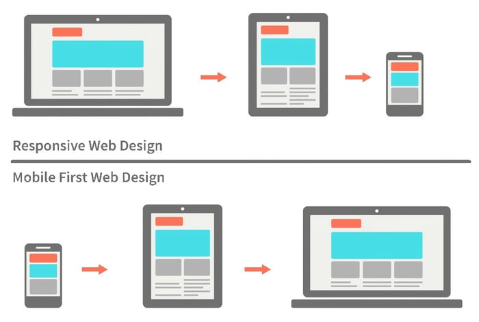
To adopt a truly mobile-first approach, content strategists and web designers must work together to determine how things should look on mobile first and then on a desktop. Mobile users still want all the information, so don’t arbitrarily cut out images, videos or even blocks of text. Instead, try to compress them for size and rearrange them in a good flow, considering the visual hierarchy. Elements like line and paragraph spacing, placement of visuals and ads, and clickable areas are important to take into consideration.
Further,
- Determine where AMP pages will work best and adopt it early.
- Consider using expandable sections if a post or resource is too long. They’re no longer bad for SEO.
- Cut down the pop-ups encouraging subscription, chat, etc. – both in size and number.
- Ensure all WordPress or other CMS plugins you use for the desktop version are working well.
Adopt Mobile SEO Strategies
According to a report from BrightEdge, search results varied vastly when queried from mobile devices – nearly half of the URLs in positions 1 to 20 ranked differently for the keywords they studied. Moreover, 35% of the first-page results turned out to be totally different.
Searches on mobile devices tend to be more question-based, particularly if the person is using a voice assistant like Siri. They’d be more likely to phrase their search as a question, such as “What time does TD Bank open?” or “Which CRM service has the highest rating?” These questions also clarify the intent of the searcher better.
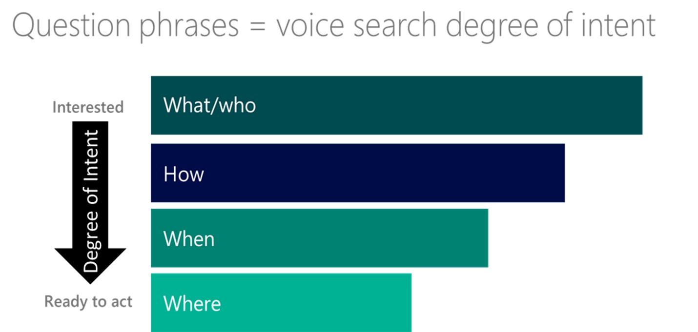
It is also important to note that voice assistants will borrow answers from answer boxes or results that include rich snippets in the usual results – structured data helps Google determine the relevance of the content.
To optimize for mobile searches, content marketers should focus on long-tail keywords during their keyword research and narrow their focus accordingly to provide clear and concise answers to specific, contextual queries.
Focus on What Actually Fuels Conversions
The real secret to improving the mobile experience is simple: give your customers what they want, when they want. People tend to use their mobile phones for convenience; they don’t want to scroll through long, text-heavy webpages to find information or make a purchase.
Conversion objectives are going to vary quite drastically when you are working with a B2B audience over B2C. The buyer’s journey is far more complex and drawn out for B2B – you can nudge your leads toward conversions with small personalizations based on the nature of their previous visits by modifying pop-ups, push notifications, display ads or landing screen CTAs.
Some CMS platforms, such as HubSpot, and web builder tools such as Duda, can help you add dynamic content to both mobile and desktop versions based on the visitor’s contextual attributes, resulting in a personalized experience at every interaction with your brand.
By tracking specific accounts, your website can automatically highlight specific content or CTAs that make sense depending on how far along the buyer’s journey they are. For instance, you can use a call-scheduling widget that can be set to appear only to qualified leads who are ready to reach out to a salesperson.
Weigh Websites versus Apps versus PWA
While creating an app isn’t necessary for many B2B businesses (but imperative for SaaS and other digital verticals), it is a great way to instantly take customer experience and service options to the next level. This is particularly helpful for B2B companies that provide software services.
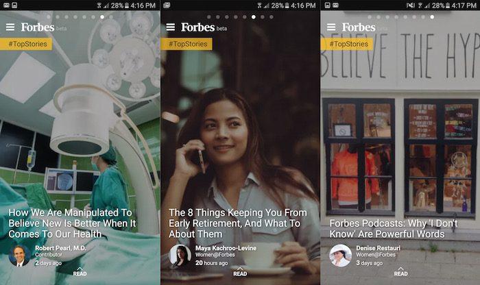
Another option is to create a Progressive Web App (PWA) that offers an app-like experience without the need for an actual app download. Forbes.com created a PWA for its mobile site as it saw that the majority of traffic was coming through these devices. Instead of looking like a shrunken version of the traditional website, the design is similar to that of an app, allowing customers to easily scroll through articles and resulting in a more pleasant UX.
Focus on maintaining a similar UX between your app and your website. Many times, companies try to cut corners and make their mobile versions less efficient and powerful, but ultimately, they end up losing customers as a result.
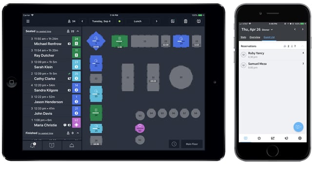
Take the restaurant booking service OpenTable (part of Booking.com), for instance. The desktop version allows users to switch between view screens to check on reservations and other important data. Users can also see a layout of the restaurant at all times. However, on the mobile app, users can’t see the current floor plan when they are trying to map out reservations. This drives a big spoke through the UX wheel.
It’s best to keep the look and feel of all digital versions similar so customers can get a consistent and congruent user experience no matter what device they are using.
Mobile-First, Always
There is no question B2B buyers are using mobile devices in seeking information and making decisions throughout the buying process. It makes sense for B2B marketers to adopt a mobile-first approach soon in order to stay ahead of the competition and offer the best possible experience to customers.

Tracy Vides

