Experience strategies built exclusively for you
Establish a brand that connects and converts
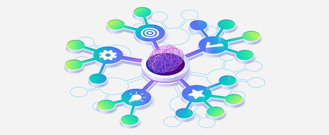
Empower your marketing efforts with strategic support
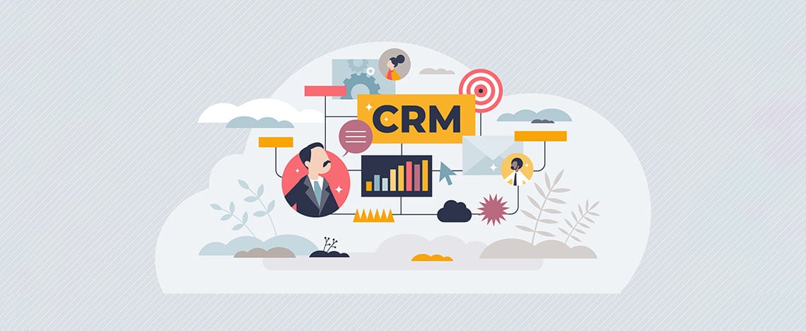
Improve pipeline efficiency and close more deals
Maximize revenue growth with streamlined operations
Create meaningful website experiences that inspire action
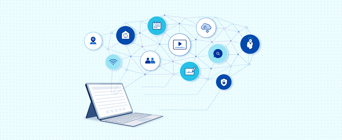
Accelerate your growth with HubSpot's AI tools
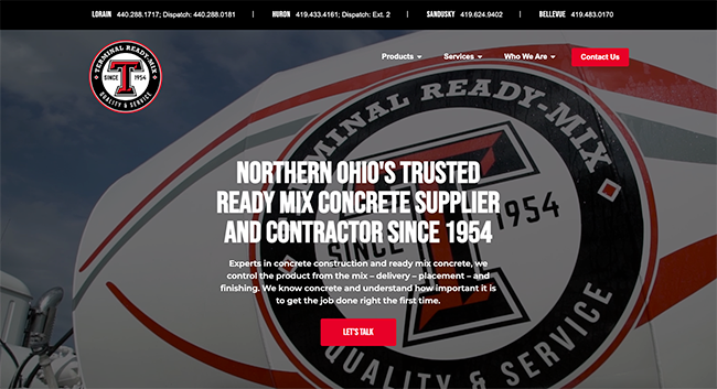
See how we create impact across industries
Engage technical minds and mass produce results
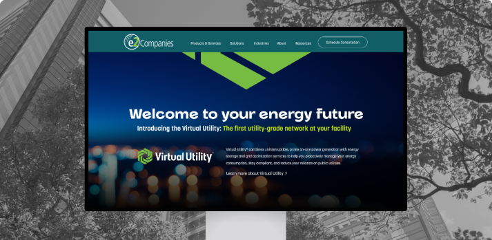
Accelerate growth in a rapidly-shifting tech world
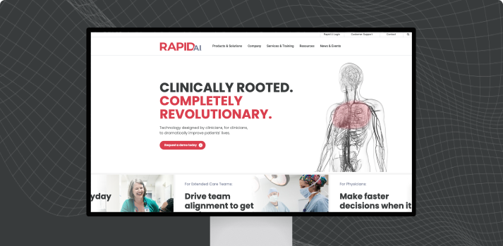
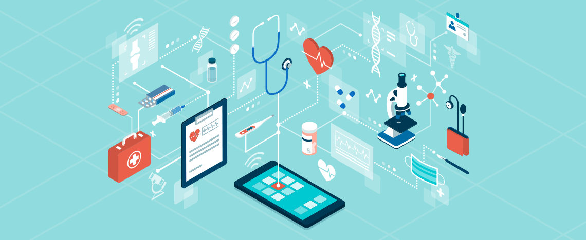
Connect your medical innovations to the right audiences
Turn your mission into an inspiring, lasting movement
From proven strategies to tangible results
Experience the agency that puts you first
Work with an agency that invests in its employees
Flexible, strategic options tailored to your goals and budget.
Benefit from our network of industry partners
Build your future with a team who cares


.png)


.png)


.png)