10 Best B2B Websites of 2019

You’ve created a product or service that solves your industry’s challenges and is widely used, right? Does your website reflect how you feel about that accomplishment? It should. B2B doesn’t have to mean boring and stodgy. At the end of the day, industry professionals are people, too, and wouldn’t you much rather navigate through a website that was visually appealing and catered to your user experience?
More often than not, websites are a potential buyer’s first impression of you, and according to HubSpot, traditional B2B websites tell potential customers three things: “who we are, what we do, and how we help.” But these things don’t help buyer’s buy, which is the ultimate goal, right?
Customers in search of a solution don’t want to scroll through websites that don’t get to the point quickly. After helping several clients create websites that have achieved their desired results (and being recognized as a top website design company on DesignRush), we believe successful B2B sites should do the following:
- Offer a pleasing visual/user experience
- Answer their questions
- Function across multiple platforms (phone, desktop, tablet)
- Load quickly
- Captivate attention/combat short attention spans by giving the viewer immediately what they want
We did a little digging and found the 10 best B2B web designs of 2019 that adhere to these and other design trends we’ve shared in the past.
10 Best B2B Website Designs of 2019
1. Magnetica
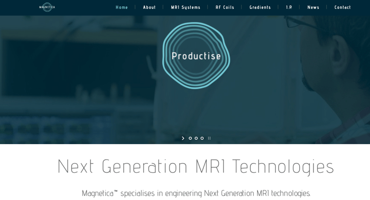
Besides being visually appealing, Magnetica spells everything out on its homepage. It explains the company’s methodology, MRI products and problem-solving capabilities in easy-to-understand language.
A call-to-action subscription box follows users throughout every page, but not in a way that blocks a user’s ability to read what’s on the page. And if you have questions about any of Magnetica’s products, there’s a simple “Email Us” button at the end of each product page. It’s a simple, straight-forward experience.
2. JCurve Solutions
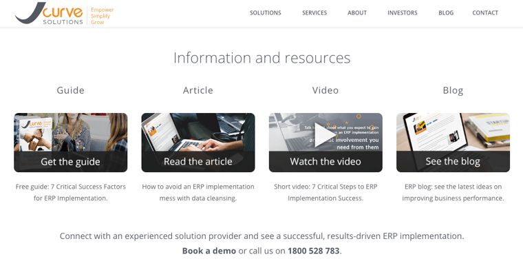
JCurve Solutions is an enterprise resource planning (ERP) solution agency. This B2B company instantly appeals to anyone considering an ERP implementation with a CTA that asks, “Just thinking about ERP?” If you’re unsure, the downloadable guide walks you through the benefits and what JCurve can do for you. The website, which caters to small businesses, thoroughly explains each product it offers using language that even new business owners can understand.
The website employs flat design techniques and even offers several videos to help further explain the benefits of ERP implementation and how to get started.
3. Sysdoc
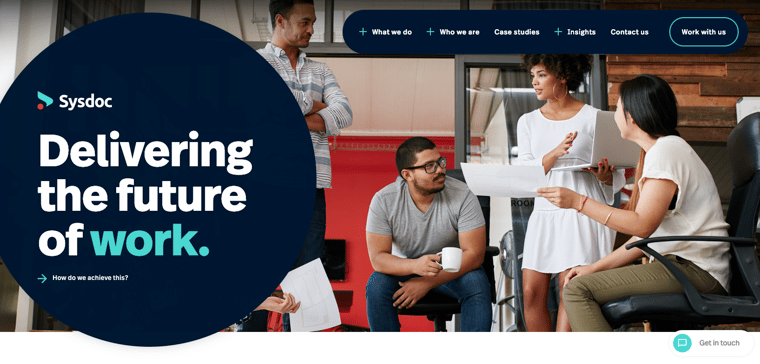
Sysdoc helps lead companies through digital transformations, keeping them up-to-date with current technologies and competitive in the marketplace. The website has a clean, modern feel with simple, short animations. Sysdoc shares its trust symbols, in the form of current clients, halfway down the homepage, which helps add to its credibility. Another great thing about this website is that Sysdoc is clear about who they are and what they can do for your company everywhere you look. Their navigation panel moves with you as you scroll, and their CTAs are well-designed and prominent.
4. Rollpark
Rollpark creates customizable parking areas for commercial vehicles using a rollable material called Geotextile. This website uses long scrolling, which means the site builds as you scroll and translates well to mobile devices.
Upon entering the site, potential B2B buyers are presented with a video of the product in action and numbers Rollpark boasts: durability, construction time, cost and more. Designers also baked in large photos that link to Rollpark case studies that present parking challenges and how Rollpark overcame them.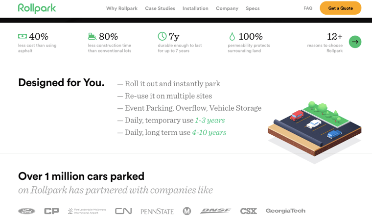
5. Powerwest
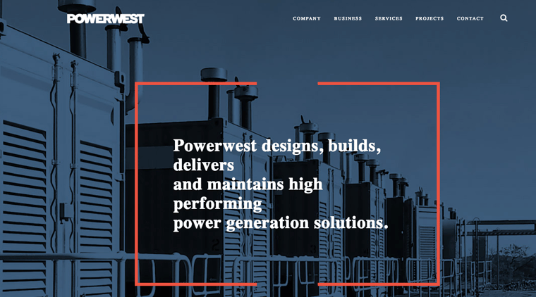
Australia’s Powerwest builds and designs power generation solutions for mining and resources companies. As soon as you land on this page, it’s immediately clear what this company can do for you. It uses language that is easy to understand, accompanied by high-quality photos of job sites. The CTAs are clear and their navigation panels are easy to follow. One of the best things about this website is that it isn’t text-heavy. The wording used is concise and to-the-point, answering questions without explaining too much. And if you do have additional questions, it’s easy to submit a query in the navigation panel that follows you as you scroll.
6. Kanbanize Software
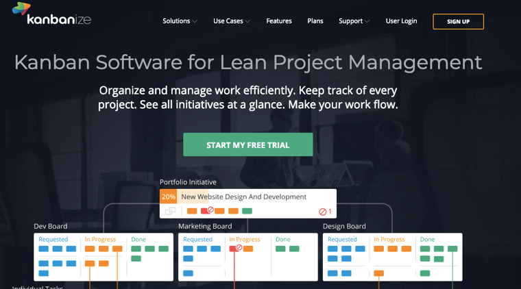
Kanbanize Software helps companies manage workflows and projects all in one place. The CTAs on the website are prominent and well-designed, and the site is transparent in terms of plans and pricing available. They even include customer testimonials and a case study video describing the success of implementing Kanbanize. The design is simple, with standard scrolling and no animations, and the colors and background images work well together. It’s easy to navigate this website as well, as the navigation bar scrolls with you and stay at the top of the screen.
7. HireLevel
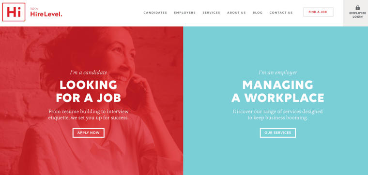
Two personas are immediately identified on HireLevel: job seekers and employers. This makes it easier to navigate the site depending on what you’re looking for. HireLevel is a staffing company that helps partner employers with prospective employees and vice versa. The website design takes a personable approach versus staunch and stale like some traditional B2B websites. HireLevel’s blog even provides helpful tips for job seekers on what employers are looking for and ways employers can keep employee buy-in.
8. Rocka
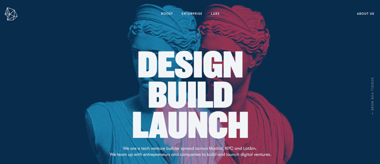
Rocka helps companies and entrepreneurs, especially startups, build and launch digital ventures. This website uses a long-scroll design but also features bold coloring and a simple, animated background of different geometric shapes. Rocka explains its process in easy-to-understand language and is transparent about all the options available to business owners and entrepreneurs. The site was also nominated for an awwward in design, creativity and innovation.
9. Packlane
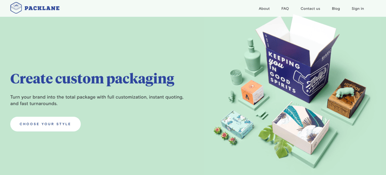
If you’re looking to package your products, Packlane offers full customization, instant quotes and a quick turnaround. The website is graphic-heavy to show the different types of folding boxes and cartons available and even has a step-by-step graphic illustrating how the process works. Packlane’s site also provides loads of photos of projects completed in the past to help inspire prospective customers. Packlane’s blog also shares different ideas for packaging design and guides to different types of packaging available.
10. Ultimaker
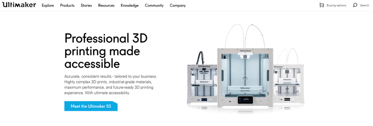
Ultimaker is a 3D printing company. Its website is clean, simple and to-the-point. The use of whitespace allows their short demo videos and high-quality pictures to stand out, keeping the focus on the product rather than the website design. Ultimaker’s website design even won CSS Design Awards Special Kudos in the past. And while 3D printing at an industrial scale can be complicated, Ultimaker keeps the jargon on its website to a minimum.
In summary, you want your B2B website to speak volumes about your company in a way that isn’t too flashy but also isn’t boring. Build a website that speaks to who you are and what you can do for your clients, and you’ll be sure to see results. Need help with your next redesign? Check out our guide on how to get the results you're looking for.


