
What Award-Winning B2B Websites Have in Common


Stellar web design today is, in many ways, an exercise in restraint. Designers must strike a careful balance between deploying the exciting new technologies at their disposal and creating digital experience that prioritize the user at every step and function beautifully on many different devices.
This means taking advantage of advanced design and animation techniques to tell compelling stories, but using these techniques sparingly and offsetting them with minimalistic elements that keep pages lightweight, fast-loading and easy on the eyes. It means merging principles of UX and inbound marketing to design clear user paths that nudge visitors toward the right content to answer their questions, and ultimately toward a sale.
What does this delicate balance look like in practice? Let’s explore some of the most prominent themes in web design today and how they’ve been applied on award-winning B2B websites.
Clean, simple interfaces
Minimalism has trended for several years now, but in its latest incarnations, designers are careful not to sacrifice usability for clean lines and white space. Some of today’s best-designed sites offer simple, easy-to-use interfaces balanced with enough information to help users complete critical tasks.
Global Payments Inc.
Global Payments Inc., a 2016 Webby honoree, sells mobile credit card payment technology for small businesses. The company's website is bright, airy and no-frills, but still manages to convey a great energy and an ideal amount of content about the product and how to get started with payments.
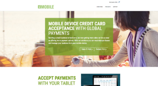
The entire site is pared down and easy-to-use, and instead of using valuable web real estate to hard-sell the product, the site focuses on informing visitors and showing them how the product works.
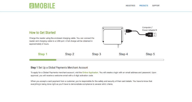
A short, simple top navigation menu lets you explore the industries the company serves, view the mobile and tablet products and get support. The mobile payment page features a simple diagram detailing the five-step process for setting up your card reader.
Riyo
Riyo is a SaaS business offering a book-dispatch-pay platform for service-based professionals like childcare providers, gardening and landscaping services, IT and computer repair services, and more. The company’s website won a CSS Design Awards Special Kudos, particularly for its use of minimalism and watercolor-style illustrations.
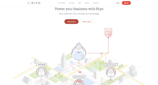
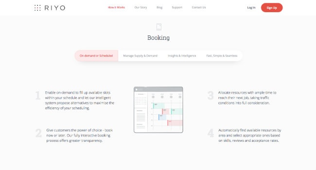
Simple interactive graphics walk users through the details of how the platform can help them schedule services, dispatch service providers and collect payment upon completion. The simplicity of the design and layout reinforces the idea that the technology itself will be simple to adopt, lightweight and easy to use.
Flat design
The trend toward simplicity and minimalism is also reflected in the move since around 2012 toward flat design—and away from skeuomorphism and hyper-realistic designs.
“A skeuomorphic design is an object that has unnecessary, ornamental design features that mimic a real-world precedent,” writes Kate Meyer for Nielsen Norman Group. “[...] Unlike skeuomorphic design, flat design was seen as a way to explore the digital medium without trying to reproduce the appearance of the physical world.”
In the image below, the skeuomorphic cart icon on the left features a gradient and beveled edges that make it look like a real-life, tactile button, communicating to users that it’s clickable. The flat cart icon on the right has no frills or special effects, just simple, flat color and imagery.
![]()
Today, “flat design 2.0” puts back in some of the important 3-D visual cues that enhance the user experience. This latest iteration of flat design is “mostly flat, but makes use of subtle shadows, highlights and layers to create some depth in the UI,” says Meyer.
James Love Legal
The website of intellectual property law firm James Love Legal, a CSS Design Award Special Kudos winner, features abstract flat shapes in contrasting colors to represent products that are typically copyrighted by law firms. Through layering and parallax animations, the designers create depth and movement without the need for drop shadows or more realistic 3-D effects.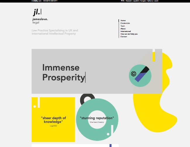
Rollpark
Rollpark is a producer of an eco-friendly parking solution that serves as an alternative to concrete and asphalt, and the company’s site recently won Site of the Day from Awwwards. The homepage leads with a fun graphic of the parking solution.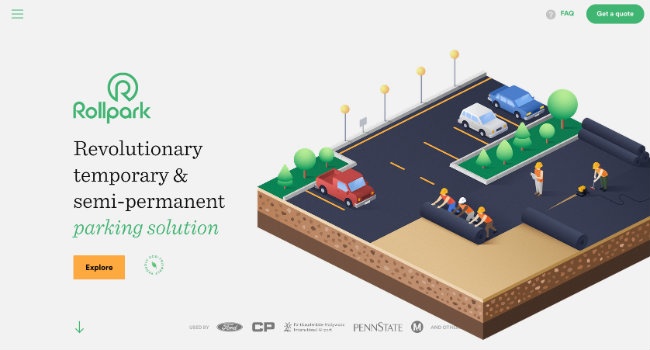
As soon as you start scrolling, the strata of the solution diagram break apart to give you a closer look at exactly what it’s made of and why it works. This is a simple but purposeful animation that aids the storytelling process and helps users better understand the product.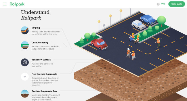
Mott Macdonald
At Mott MacDonald engineering consultancy, which won a Special Kudos award from CSS DesignAwards, designers recognized that pictures speak louder than words when it comes to showcasing grandiose infrastructure projects.
So they used the site’s homepage video background to show, rather than describe, a handful of their impressive engineering projects around the globe. In this case, the dynamism of video is a better choice than text to demonstrate the scope of their work and impart a powerful sense of place, which is a pillar of strong storytelling.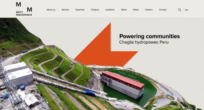
Thoughtful, intuitive user paths
The best websites today are user-obsessed; they’re focused on helping and teaching rather than selling and promoting. They organize information and employ design cues that guide users toward answers to their questions and further along the buyer’s journey until they’re ready to make a purchase.
Merrill Corporation
Merrill Corporation, which provides solutions for secure content sharing, regulated communications and disclosure services, just earned a 2016 WebAward for Best B2B Site from the Web Marketing Association.
To guide users through site content, the top navigation menu organizes the company’s solutions according to what users might be trying to accomplish: financial transactions and reporting; marketing and communications for regulated industry; and customer content and collaboration.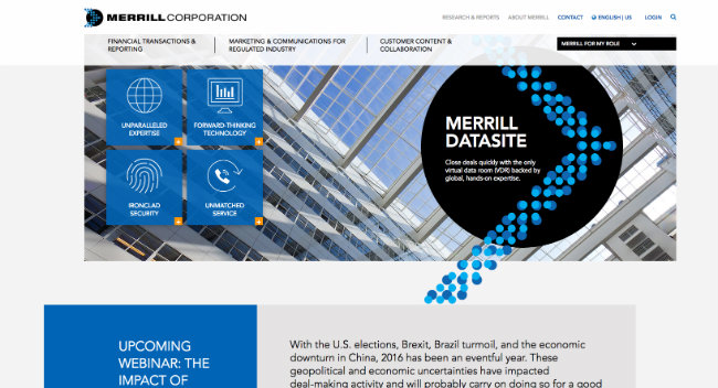
Interactive diagrams deliver greater detail about the solutions and their features.
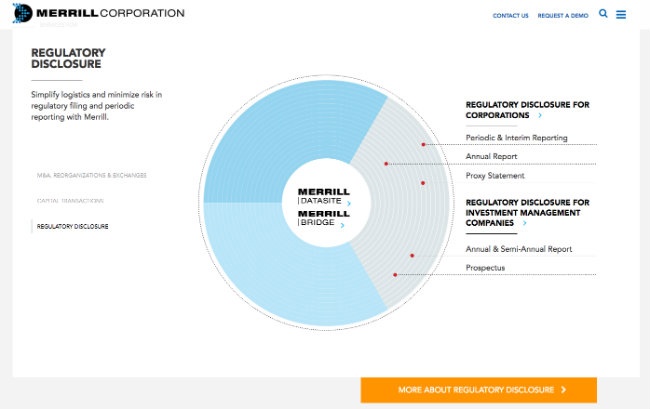
User paths are even more clearly segmented through the upper-right hand drop-down menu, labeled “Merrill for my role,” which lets users home in on the technology offerings that are purpose-built for the type of work they do.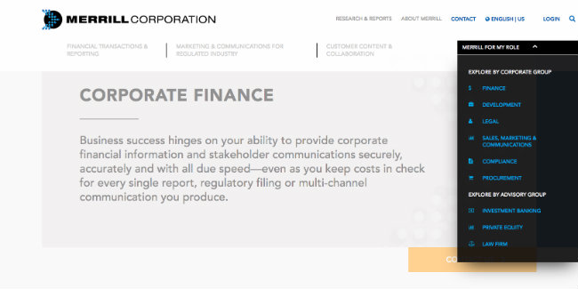
Great aesthetics and functionality, regardless of device
Responsive layouts and mobile-friendly interfaces are non-negotiables in modern web design. The best sites rely on the principles of progressive enhancement to create layouts that look beautiful and maintain all critical functionality whether you view them on a large desktop screen, a tablet or a smartphone.
Ultimaker
Ultimaker, a 3-D printing company and another CSS Design Awards Special Kudos recipient, has a sleek design that features several demos, educational resources and community stories. The site’s interactive content adjusts seamlessly to a range of screen sizes.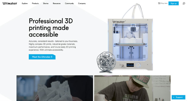
Ultimaker desktop view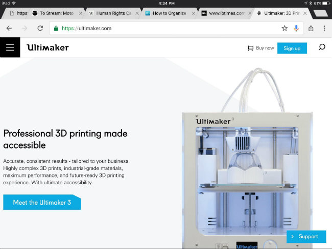
Ultimaker tablet view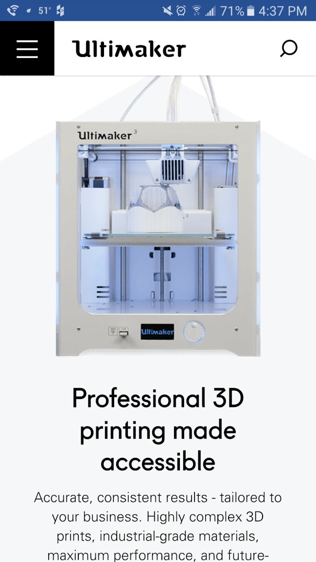
Ultimaker smartphone view
BlueGranite
Similarly, Kuno’s website design for BlueGranite, a cloud analytics provider, illustrates mobile-optimized, beautifully responsive layouts in action. You get all the same great content and functionality, no matter which device or screen size you’re browsing on.
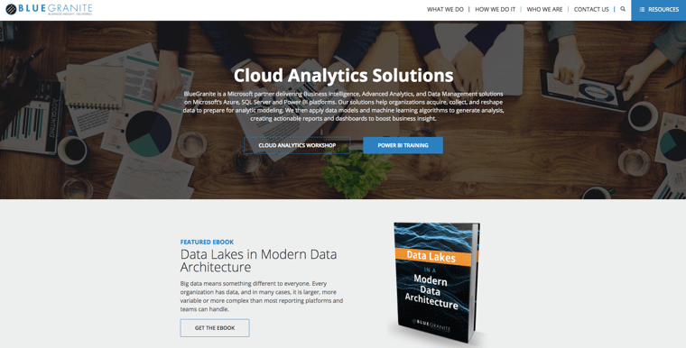
BlueGranite desktop view

BlueGranite tablet view
BlueGranite smartphone view
Bringing it all together
Whether it’s paring down your UI for a simpler, more straightforward experience, flattening out your graphics for a modern look and feel, or digging into your site data to better define your user paths, all successful websites require one key ingredient: a relentless dedication to your users and their needs. If you put your site visitors first in all of your design and interaction decisions, your most important web property will be better-equipped to help you meet your business objectives.
If you’d like to learn more about how we apply the key principles of effective modern website design at Kuno Creative, download our eBook, “High-Performing Websites that Last: Creating Digital Experiences that Engage.”


