Revenue-Generating Website Design is Growth-Driven and Mobile-First


If your business website looks outdated, serves up a confounding user experience, or—gasp!—isn’t responsive, you’ve probably got a redesign in the works.
But the very words “website redesign” often elicit groans from employees. Many people associate them with a drawn-out, painful process yielding a new site that confuses customers and retains many of the problems it started with.
The truth is the traditional website design process needs a redesign itself.
Problems With the Old Model
The traditional website design cycle happens every two or three years. The process starts with a lengthy period of planning, user research and requirements definition that culminates in a snazzy set of wireframes and content maps. Next comes development, followed by launch, at which point everyone crosses their fingers and hopes the new site does a better job of supporting business goals—until the next redesign a few years later.
The old model is also based on a “desktop-first” design approach: Designers start with all of the complexity they want to include in a site for full-size desktop or laptop screens. Then they strip away features and content to create versions of the site for smaller screens, in an approach known as graceful degradation.
So, what’s wrong with the status quo?
- It’s slow and expensive. The average small to medium-sized business website takes months to launch and costs between $15,000 to $80,000 up front, according to Media Junction. Large-scale enterprise website redesigns can take even longer, which means features can be outdated or off-trend by the time a site goes live.
- It’s high-risk. It requires a significant time and resource investment up front, and because there’s generally no live user testing of the new site before launch, there’s no guarantee the new design will actually help you meet business goals or solve users’ problems. After launch, there’s often little flexibility to make changes to accommodate new business or audience needs.
- It treats mobile as an afterthought. The desktop-first approach can leave mobile users with a subpar experience, lacking in richness and core features. With people now spending 51 percent of their media time on mobile devices, compared with 42 percent on desktop or laptop, a poor mobile experience can pose a real and immediate threat to your reputation and sales.
Given these challenges, some businesses are adopting a more modern approach to website design that emphasizes incremental improvements, data-driven optimizations and seamless experiences across a plethora of devices.
Scale and Flexibility Through Growth-Driven Design
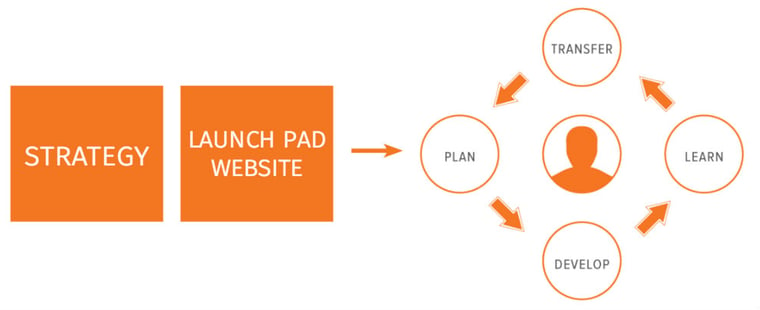
Instead of viewing your website as a static entity, growth-driven design treats it as a dynamic, living, breathing organism that should grow and adapt with your business. Like the traditional process, growth-driven design begins with a strategy phase, but design teams try not to get bogged down in strategy for too long. Recognizing that no website launch is ever flawless, they implement a new site design faster, in the form of what Media Junction calls a “launch pad website.”
From there, designers test, optimize and repeat. Through this cycle, businesses can gather real data about how their new site is being used and what problems need addressing. They plan and develop site improvements, collect data to learn whether the changes were successful, and then transfer those lessons to other areas of the business, like sales and marketing.

Image source: Media Junction
Growth-driven design offers reduced risk and shorter time to launch; by planning for continuous improvements, the stakes of a redesign are lower and more evenly distributed over time. Incremental changes are also easier on site visitors, who can find large-scale overhauls confusing and frustrating.
With growth-driven design, there’s no longer a need to build every desired feature or optimization into a design before launch. Businesses gain the flexibility to continuously optimize conversion points and user experience, and to add personalization features and marketing assets over time, making decisions informed by real user data.
Beyond Responsive: Embracing “Mobile-First”
The ability to make incremental, user-centered updates to your site is a huge plus, but it won’t do you much good if you’re still designing primarily for desktop users.
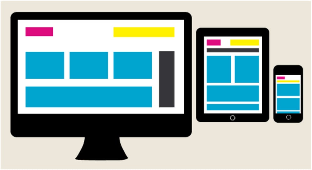
Mobile-first design is a holistic approach to designing for a multi-screen world. Instead of starting with a full-sized Web experience and cutting it down for smaller tablet and mobile phone screens, “mobile first” means designing a rich experience for mobile devices as step one, and scaling up from there.

For years, responsive Web design has been gaining ground as a preferred design tactic, but the mobile-first approach takes it further by using the mobile experience as a starting point instead of a last step. Rather than applying the principles of graceful degradation described above, mobile-first design follows the tenets of progressive enhancement, starting with a simple, universal experience that looks and works great on small screens and building in advanced functionality that will kick in on larger displays.
“Don’t leave users squinting or pinching and zooming just to read your website copy,” writes Jaron Rubenstein. Bearing mobile in mind from the get-go forces businesses to design for optimal touch targets, portrait and landscape views, and real-world screen resolutions.
Screen size isn’t the only mobile-first design consideration. Mobile devices often mean spotty Internet connectivity, lower computing power, lower power supply, fluctuating lighting conditions and users who are more likely to be moving around instead of stationary. These challenges require mobile-first designers to take a ruthless approach to content prioritization, removing or simplifying elements that will detrimentally drive up page load times.
Designing for real users and a multitude of devices requires research and rigorous cross-device testing, but it’s worth it. An impeccable multi-screen user experience will increase conversions and sales by removing barriers throughout the buyer journey.
The Way Forward for Modern Businesses
As smartphones, tablets, laptops, wearables and other Internet-enabled devices continue to evolve and proliferate, the need for dynamic, flexible websites is magnified. Device- and platform-specific user data has the potential to further enrich your Web experience and your sales and marketing strategies.
Growth-driven and mobile-first design go hand in hand: Both are inherently iterative, and both emphasize the increasing importance of listening to your customers, learning from them and having the ability to react. But you can’t forget about the user experience up front, either.
“In 2016, the gap between customer-obsessed leaders and laggards will widen,” according to Forrester. “Leaders will take on the hard work of shifting to a customer-obsessed operating model; laggards will aimlessly push forward with flawed digital priorities and disjointed operations.”
Companies whose digital priorities include a modern website design process that applies UX, mobile-first and growth-driven design strategies will be able to move faster, personalize more effectively, and outpace the growth of lagging competitors.
To learn more about how Kuno Creative is incorporating UX, growth-driven design and mobile-first strategies into Progressive Enhancement Website Design, check out our new eBook, “High Performing Websites That Last: Going Beyond Growth-Driven Design.”


