


You might be slowly losing web presence.
If your website design is not catering to the ever increasing segment of the market surfing the web with mobile devices, then you most definitely are. When a mobile user visits your mobile-unfriendly site, he will have a difficult time finding what he’s looking for and will inevitably leave—quickly.
But what’s the solution?
Today, the most effective way to provide a seamless browsing experience for the mobile segment of your visitors is to use responsive web design. Although it is a relatively new concept, it has already become the go-to choice among savvy designers and marketers who understand the importance of reaching their mobile audience.
What are the Numbers Saying?
Since the number of mobile users surfing online is breaking records every year, the current trend in the market is that they will actually be a majority online in just a couple of short years.
Not only that, but Google has actually come out with a guide for website owners, in which it states responsive design is its preferred configuration for mobile websites. And you want to be on Google’s good side, since it can single-handedly determine your search rankings and, in turn, your organic traffic numbers.
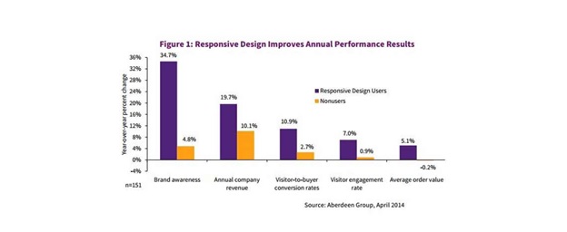
Additionally, a recent study by the Aberdeen Group found websites are achieving about 11 percent higher visitor-to-buyer conversion rate increases compared to non-responsive sites, which only receive a 2.7 percent improvement in performance year over year.
Numerous examples from companies, including CareerBuilder, FreshSparks and many others, have reported tremendous increases in their traffic after switching to responsive web design.
How does Responsive Design Convert Users?
Shopping online with your phone has been a pain for a long time – since the start of mobile web surfing, anyone who wanted to any kind of shopping on the web had to display tremendous patience.
With responsive web design, all of this can quickly change. There are already great examples of savvy businesses making improvements to their sites that turn the shopping experience into a fast and painless one.
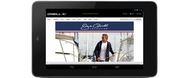
For instance, O’Neill Clothing reported an incredible 407 percent increase in its conversion rate on Android devices alone following its switch to a responsive website.
The Effect of Responsive Website Design on Mobile Conversions
Numerous companies are reporting their success with responsive website design, and it has become a trend too difficult to discredit, even by its harshest opponents. That’s because the premise is simple – if a company doesn’t have a design that can easily adapt to any device, its conversion rates from mobile will most likely remain stagnant.
But if you still need convincing, here are a few concrete testimonies from companies that found great success with responsive design:
- A company named Bench increased its mobile conversion rate by 100 percent following the switch to responsive
- State Farm, a huge corporation, received a 56 percent mobile conversion rate increase
- A company named Harviestoun received a 28 percent increase in mobile traffic
- Baines & Ernst saw a leap in mobile conversions of more than 50 percent
Responsive vs. Dedicated Mobile Website: Which Should You Opt For?
Now some might argue a responsive site is not a necessity if you want to cater to your mobile audience. After all, just a short time ago many companies opted for mobile website design and it seemed like a viable solution.
But with the dramatically increasing number of mobile users, along with the vast amount of different devices, it has become virtually impossible to ensure your website functions well with every screen parameter, browser and device capability.
What really separates responsive web design from its alternatives is the ability to easily and seamlessly adapt to any device, optimizing the user experience and making sure every buyer receives a terrific browsing experience, no matter what device is being used.
With the projected continuous growth of the mobile online market, having a design that caters to that audience is no longer a choice. So if you do not want to lose your web presence to a more progressive competitor, don’t wait any longer. Start providing an excellent mobile experience for your buyers.
Shayne Moore is a Director at a leading web design agency Christchurch, having a pool of creative web designers who translate ideas into beautiful and eye-pleasing designs. Shayne is passionate about digital marketing and loves to share his creative ideas on the latest design trends. For more information you can visit Google+.

Kuno Creative

