


 Kevin Kononenko, growth marketer for Databox, shares how the app can help marketers truly track content marketing ROI during each stage of the inbound marketing funnel.
Have you ever sat back and wondered, “Why the heck am I creating this content in the first place?”
OK, that is probably an easy answer. So let me ask perhaps the more important question.
“Does my boss [or client] understand why I am creating this content?”
They pay you, after all, so you should make sure they have a compelling story in their heads about why you are creating all that content.
If either of you believes you should create more content to generate more traffic, that is a major red flag. In reality, you are creating more content to generate more leads. And later, more customers.
If none of your visitors sign up for your list or fill out a form, then you still are missing an actual strategy that will help you meet your marketing goals. And, if the sales team never reaches out to qualified leads created by the marketing team… well, idle leads are worth $0.
Note: Once contacts are in your database, engagement may become your most important key performance indicator (KPI), but you need to get them to convert first.
This may sound obvious, but if you can’t communicate this goal to your boss, you both will suffer eventually. You will find that you have directed your time and money into the wrong place.
A Strategy for Tracking Content Marketing Metrics
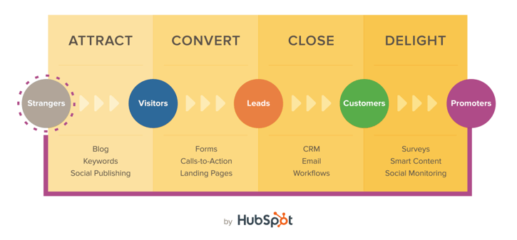
You must be able to measure your marketing campaigns in an understandable way. We recommend HubSpot’s four-step inbound marketing funnel. It’s straightforward and encourages your brain to focus on the pathway from visitor to happy customer.
This provides clarity on which specific metrics you should track, and why you are tracking them in the first place. We put together a sequence of three automated marketing dashboards that cover the first three steps of the funnel. These will solve a few problems for you for free.
- Metric strategy: You don’t even need to think about which metrics to track. Full guides to each step of the funnel are below.
- No more copying and pasting: You don’t need to copy/paste into a spreadsheet or take a screenshot. After five minutes of one-time setup, these dashboards will update automatically with your latest data so that your metrics are always current.
- No need to format a report: If you hate putting together monthly reports on your campaigns, these are ready to be presented instantly. And you can use streaming URLs and automated emails so that you never even need to send an email to team members.
Keep in mind: These dashboards will work only if you use HubSpot and Google Analytics.
Attract: SEO Performance Dashboard

What It Does: The SEO performance dashboard gives an overview of all sources of traffic, but mainly focuses on organic traffic. It shows you whether visitors actually stick around to view multiple pages on your site, so you know your site reaches the right audience. It analyzes organic traffic in two ways:
- Via overall rankings on Page 1 of SERPs
- Via ranking for specific highly trafficked terms
Why You Need It: If you rely on your blog to generate traffic every month, you need a reliable stream of organic traffic. A blog with high-quality content is a powerful asset because it builds compounding value—you gain more authority and make it easier to rank highly in the future.
You also need to have some tactics for specific keywords. In a world where a small percentage of blog content creates a majority of organic traffic, you need to defend and improve your positions on competitive keywords.
Metrics Tracked:
- Sessions by Source
- Pages per Session/Bounce Rate
- Visibility in SERPs
- Top Keywords by Position
- Top Keywords by Sessions
Note: This dashboard uses SEMrush, which can be pricey. If you need an alternative, you can use Google Search Console for free. Here are some dashboards that use Google Search Console.
Convert: Marketing Overview Dashboard

What It Does: The Marketing Overview dashboard tracks your website’s success at collecting contacts. It examines two common types of conversions: landing page submissions and email list subscribers. It ensures your website behavior and conversion rates stay steady over the course of the month.
Why You Need It: This is the entire reason you are generating traffic in the first place! If you are not seeing form submissions and email signups, then you cannot expect sales six to nine months in the future.
Also, you can ensure your metrics do not decline after you create a steady flow of leads. If your conversion rate falls sharply, something on your site may be broken. If email engagement drops, it may be time to change the way you interact with your list.
Metrics Tracked:
- Monthly Visits
- Monthly Contacts Created
- Funnel Stages
- Email Opens/Clicks
- Blog Post Views
- Landing Page Submissions
Close: Sales Overview Dashboard
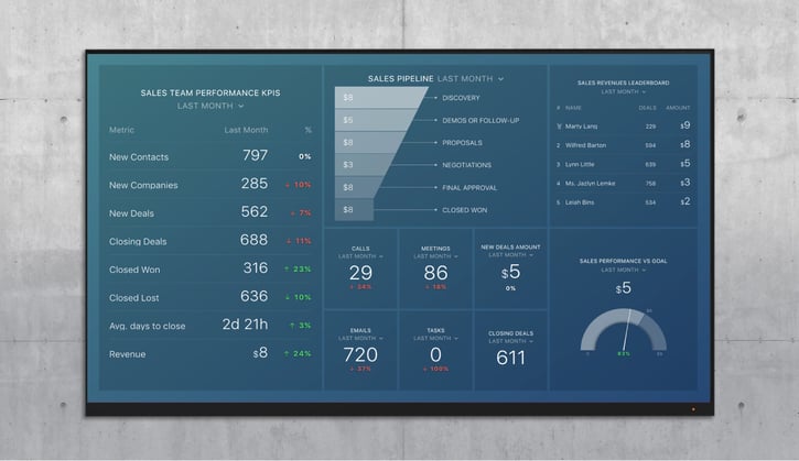
What It Does: The Sales Overview dashboard examines conversion rates at each step of your funnel from HubSpot CRM. It reveals the top-performing members of the sales team, and tracks progress toward the monthly goal. It ensures your sales team logs enough activity to keep the pipeline fresh and on pace to meet future monthly goals.
Why You Need It: If you need one place to monitor the bottom of the funnel, this has your top metrics. It helps track individual team members so you can see the contributions from each salesperson. It tracks all types of activities your sales team needs to close a deal. And it monitors all stages of the pipeline so you can see where you lose deals.
Metrics Tracked:
- Deals at Each Stage of Sales Pipeline
- Total Emails, Calls, Meetings and Tasks Completed
- Top Salespeople by Closed Amount
- Progress to Monthly Goal (Dollars)
Easily Make Data-Driven Content Marketing Decisions
You can immediately begin using all three reports in Databox for free. Once you set up your dashboards, your data will update automatically every day. This means you can spend all your time analyzing the data rather than formatting reports.
Once you can build reports in seconds, you have a few new opportunities to make data-driven decisions throughout the month. You can automate many of your manual reporting and monitoring processes.
Alerts update you when you are on track to miss your monthly goal, or if one metric seems to be falling off a cliff. Or, if you meet your monthly goal early, you can immediately send a notification to your boss or client.
Annotations allow you to add notes to specific metrics so that your entire team knows what is going on. So, if you made a particular change in your marketing or sales, you can annotate your chart and see if the metrics improve.
Insights collect the latest updates from your metrics so you do not even need to check the dashboards. You can prioritize your efforts based on which metrics need to be addressed to hit your monthly goal.
Need help further identifying content marketing KPIs? Get our free checklist here.

About the Author: Kevin Kononenko is Growth Marketer @ Databox. Making it easy for marketers to tell the story of their success. Everton FC supporter. Startup guy.

