
Think about all of the logos you encounter on a daily basis. What do they all have in common? If you saw golden arches, you would immediately recognize it as McDonald’s. If you saw a red circle with a dot in the middle, you would know it’s Target. A blue, fluttering bird? Twitter.
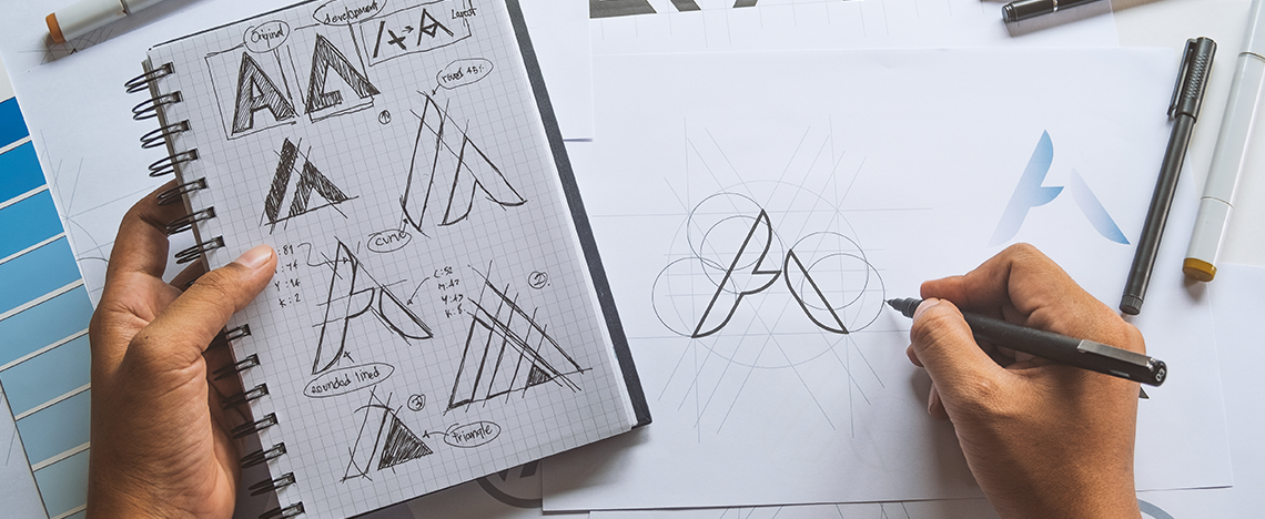
All of these logos are memorable and they convey a message to consumers. Your B2B logo should do the same. As you embark on a business rebrand, there are six design elements your B2B logo should include. It’s easy to fall into the rut of doing what everyone else is doing, but to stand out, you need to leave a lasting impression on your potential customers.
In this blog, we’ll share the six design elements and examples of B2B brands whose logos adhere to these standards.
6 Effective B2B Logo Design ElementsThe last thing business owners want is for their company to blend in. In a world with so many options, you need to stand out in the crowd and be the company consumers choose again and again. Here’s where your logo can help.
Effective B2B logos should be:
- Original
- Simple
- Memorable
- Versatile
- Relevant
- Timeless
Here are six of our favorite B2B company logos and a brief explanation of why they work.
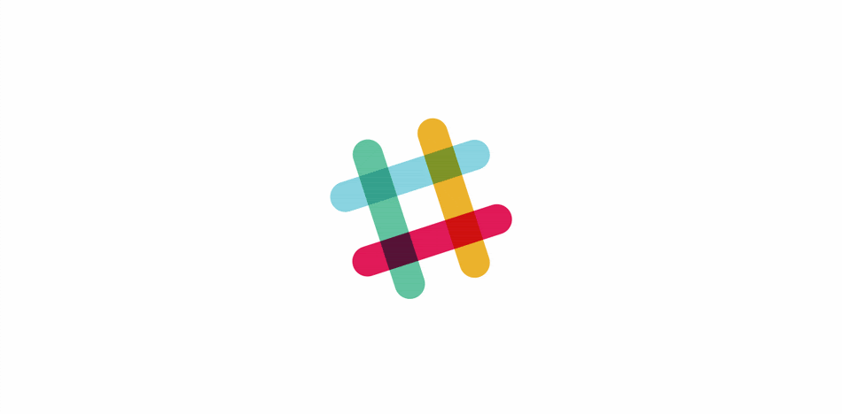
Slack
Slack is a collaboration hub where your team can meet to assign tasks, share files, chat and more. The company refreshed its look in January 2019 saying “[The old logo] was also extremely easy to get wrong. It was 11 different colors — and if placed on any color other than white, or at the wrong angle (instead of the precisely prescribed 18º rotation), or with the colors tweaked wrong, it looked terrible. It pained us.”
In other words, the brand identity wasn’t cohesive across platforms, and it definitely wasn’t simple. The new logo still features Slack’s signature hash symbol, but now it’s only five colors and the logo aligns with the brand whether you’re on desktop, mobile or tablet.
 PayPal
PayPal is an online money transfer service. In 1999, PayPal created a logo that had big block letters using its signature blue. In 2007, the logo changed to italic lettering spelling PayPal using two different hues of blue. The 2007 iteration was more legible than the original logo, but it didn’t work on various background colors.
![]()
Credit: 1,000 Logos
Today, we know it as the spelled-out logo and the two blue-hued Ps — simple and easily recognizable on any site. The successful logo features slightly brighter blues but adds the overlapping Ps, which symbolize the company’s mission to connect the world.
Grammarly
The Grammarly logo is one of our favorites. It’s an online writing assistant that uses artificial intelligence to help users say (write) what they really mean in ways that go beyond grammar. The high-quality logo, a simple green circle with an arrow that forms a G, follows users throughout their experience of using the software. It’s a cohesive experience and translates across multiple platforms. Tying the logo back to the tangible product is a big win.
![]()
IBM
IBM is known internationally for its iconic, simple logo. According to IBM, the black and white logo was designed by Paul Rand in 1972 and has remained since. The horizontal stripes replaced the solid block letters to suggest "speed and dynamism." It is one of the most recognized logotypes in the world.
![]()
Salesforce
Salesforce is a cloud-based customer relationship management tool that also offers a suite of applications focused on customer service, marketing automation, analytics and app development. This is another example of where the logo matches the service — the word “Salesforce” within a cloud, which is what the service is built on. This logo is to the point while still being visually pleasing.
![]()
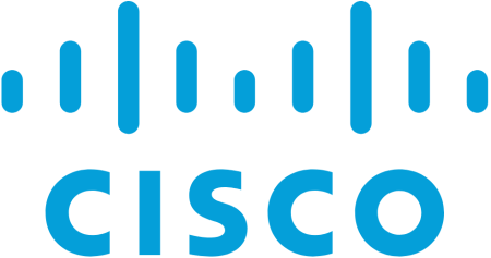
Cisco
A version of Cisco’s Golden Gate Bridge logo has been in place since 1984. The original version of the logo looked similar in color and shape to San Francisco’s famous bridge, but as the digital world exploded, Cisco’s logo evolved.
![]()
In 2013, the logo switched from red tines to the blue tines we recognize today. This is another example of a logo that’s simple, recognizable and speaks to the company’s vision of a connected network — in the same way the bridge connects people in San Francisco.
Design a Great Logo
An amazing B2B logo can propel your business in the right direction, but it needs to speak to who you are and what you do. A digital marketing agency can help hone your message and design a logo that matches your mission. Ready to get started?