Mobile Inbound Marketing - Is Your Website Mobile-Ready?

In a previous post I presented some amazing statistics about the rapidly growing mobile marketplace. In particular, there are more than 70 million people browsing the mobile web each day in the U.S. alone. A recent study by Morgan Stanley predicted that by 2015 there will be more mobile web users than desktop users. Have you checked your website on your smartphone lately?
There are several important things to consider:
Mobile Marketing Strategy
Should you worry about your mobile website now? If mobile is rapidly becoming the dominant web venue, why wouldn't you? Can visitors to your site read your content, or is the text too small, the layout wonky? Unless your 950 pixel by 640 pixel layout is viewed on an iPad, chances are it's tiny and unreadable without lots of awkward zooming and scrolling needed to navigate and consume your content. Will visitors take the time to do that? Doubtful. If you're on an iPhone or iPad (at least for now), your fancy Flash banner just looks like a big empty space. If you're SEO strategy is working, your mobile website will come up in a search on any mobile device. Why wouldn't you be obsessed with the first impression a visitors receives?
Mobile Web Content
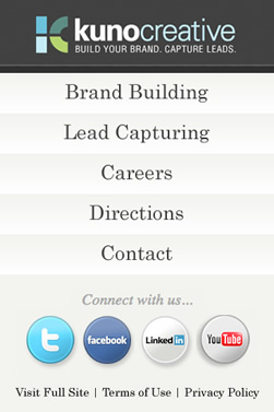
 Think about mobile web users. What are they doing? Most are traveling or going from point A to point B. Unless they are stuck in an airport for hours, they aren't interested in reading long documents or pages of text. They want immediate, valuable information. If they are in meetings or just walking down the street, they want to know what's going on in small, readable chunks. You need to boil your website down to its essence. What is the most important message I need to get across to a mobile visitor? Is it the latest news from your company, or is it a valuable offer they shouldn't miss just because they aren't in the office? Either way, it needs to be up-front-center when they find your site via search, social media or e-mail. Think about blog posts that are shorter and contain optional links to longer versions. Think about video - it's more important than ever, since most smart phones are great for video, and it doesn't require reading a lot of tiny text. Here we present a sneak peek at our own mobile website, coming soon!
Mobile Web Design
There are lots of devices, lots of screen sizes, and lots of software compatibility issues for HTML and CSS with different smartphones. You probably can't easily design your mobile website to accommodate all of them. Have your web designer check out "responsive web design" as a method to adapt to as many mobile devices as possible. Now think about usability and layout. Keep it simple. You might want to present a vertical menu with large buttons linked to key items that you want your visitors to explore. Each page should be simple as well - easy to read and easy to navigate back to the main menu. You don't need to show everything on your mobile website, just the really important content for mobile users. Keep your forms simple as well - don't force users to zoom in to fill out the fields or submit the form. Good sites often include a link to the non-mobile version of the website, just to be as complete as possible. Here are some great mobile web designs that illustrate these points.
Transforming Your Web Design to Mobile-Ready
- Develop a strategy for the mobile web. Consider your target market, what they are doing and what they are looking for. Deliver that.
- Determine what content you will publish and how you will organize it.
- Figure out how you will deploy your mobile site. Will it be a separate domain, such as "mysite.mobi", or an adaptation of your current website using cascading stylesheets?
- Have a professional web designer or agency handle this project. It's not simple, but the rewards are potentially great.


