

A website should tell a story. Everyone can agree on that, at least in theory.
In practice, though, most websites tell many stories at once, often to no one in particular. The average website will explain what the company does, gesture at who it might be for, sprinkle in a few proof points, and hope the right people find the right information at the right time.
If they don’t? Well, there’s always a form at the bottom of the page to learn more.
Inbound marketing has always asked more of websites than simply to look good. A site has to make its relevance clear from the first touch, build trust as people explore, and support action when they’re ready to move forward. The idea that a website is just a digital brochure is decades outdated. And it’s not just a destination to funnel the largest number of people you can to, either.
It’s a brand experience that takes the user on a journey. UX and UI design principles sit at the center of that journey, gently nudging and guiding the user along to the next step and, ultimately, a buying decision.
Done well, your website becomes a meaningful driver of growth and conversions. Done poorly and it becomes one more friction point in a bogged-down sales process.
Website Friction: The User Experience Momentum-Killer
Let’s talk about a common website experience for a minute.
A visitor arrives to your company’s site. Maybe they found you from organic search or from a paid campaign. They may have landed on your homepage, but more likely than not, they come in from a side door.
They click around, checking out a Product page here and the About Us page there. They scroll, but not very deep down the page. They’re trying to understand what category of solutions you’re in and whether you matter to them.
They leave. And then come back. They start looking for proof of credibility: outcomes, scale, evidence that this works for people like them and brands like theirs. Maybe they pull up a competitor’s website and compare the two side-by-side. They encounter a CTA that feels premature or generic, and leave again.
This is not a theoretical example: We see this all the time in our website redesign work.
We look at how users interact and move around websites with heatmaps, user recordings and other behavioral insights. We are able to dig into where people enter the site, how long they spend on a page, and where they drop off.
This type of bouncing around is incredibly common, even on beautifully designed websites with great content. It’s not necessarily a bad thing, but backtracking and page-hopping often signal that people are unsure of where to go next. Friction is a momentum-killer, says Newton and UX designers everywhere.
This is where thoughtful UX design and brand strategy, grounded in inbound marketing philosophy, come in to smooth away the friction and direct the exploration to a conversion.

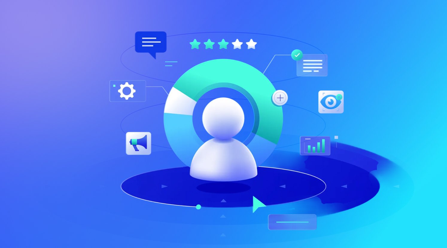
How Does Your Site Stack Up? 6 Key Points To Evaluate UX and UI
User experience (UX) and user interface (UI) are closely linked, but they’re not the same thing. UX focuses on how people move, decide, and feel across the entire journey while the interface brings that thinking to life through visual and interactive choices.
When evaluating your website, it helps to look at the experience through the lens of these six UX and UI principles.
1. Usable: Can Users Understand What You Offer and What To Do Next?
Usability is often mistaken for simplicity. In reality, it’s about whether users understand what’s in front of them with minimal effort.
A well-designed interface uses visual hierarchy, clear visual cues, and intentional design elements to guide users without adding to cognitive load. The goal isn’t to say everything at once, but rather to enable users to orient themselves quickly.
Common strengths we see include:
- Early persona-based wayfinding
- Clear orientation before depth
- Design flows that build confidence, encouraging users to take the next step
If someone has to figure out where they belong, you’ve already introduced friction.
2. Findable: Can Users Locate the Content, Proof and Paths They Need?
Findability starts earlier than the website itself, with how people encounter your brand through organic search, generative results or paid media. And that experience continues once the user arrives at the site and begins to explore.
Many websites technically contain everything users need, but it’s spread across sections that don’t match how users think or explore. Proof points live deep within pages and outcomes appear after long explanations. Even when SEO, AEO or paid media successfully draw the right audience in, users are left reaching for meaning and piecing together the story themselves.
Stronger findability comes from:
- Persona-specific landing pages surfaced early
- Proof-forward content hierarchy
- Reducing unnecessary elements that distract from key points
People don’t want infinite options. They want confidence that they’re in the right place and answers to their questions in that moment.
3. Credible: Does the Experience Build Trust at Key Decision Moments?
Credibility isn’t something you establish once. It’s reinforced through consistent experiences, language, and evidence across the website.
Strong brand recognition and the right tone help, as do signals of scale and expertise. But for a lot of websites, credibility often shows up too late, after users have already questioned whether a solution applies to them. Stories, outcomes, and real-world validation are frequently tucked away, treated as supporting material rather than central narrative elements.
That means:
- Surfacing proof early and often
- Aligning credibility signals to different personas
- Integrating outcomes directly into the narrative
Trust is cumulative, and UX principles play a direct role in how quickly it’s earned.
4. Desirable: Is the Experience Emotionally Compelling?
Desirability is where things can get uncomfortable for B2B. Not because it’s frivolous, but because it forces an emotional reckoning.
Buyers aren’t just comparing features; they’re also weighing risk, professional identity, and personal stakes. When the messaging focuses only on benefits without acknowledging those pressures, the experience can feel hollow, even if the copy and design are polished.
Human-centered language helps, but it should be paired with visual storytelling that signals ‘We understand you. We know what’s at stake, and we’ve got you.’
Desirability increases when you:
- Align storytelling with persona motivations
- Design for how users see themselves
- Create interfaces that make users feel seen, not sold to
Users don’t just want to know what a product does. They want to know what it means for them.
5. Accessible: Is the Experience Inclusive by Design?
Accessibility is about inclusion, first and foremost, to make sure that people with different abilities can navigate and interact with your website without barriers.
Visual accessibility plays a central role here. Color and contrast, readable text size, clear typography, alt tags on images, proper heading structure, and other practices all contribute to a more accessible experience. Keyboard navigation and screen reader compatibility help users with visual impairments engage across devices and screen sizes.
Many organizations, particularly in healthcare, have made real progress here. The mechanics are sound, and compliance is addressed. In many cases, accessibility requirements aligned with WCAG standards are met thoughtfully and consistently.
Good accessibility is not optional: it’s a baseline expectation for websites now.
6. Valuable: Does the Experience Actually Deliver?
Finally, value: the principle most often assumed rather than articulated.
Value is the point at which UX, content, and business strategy either align or quietly fall apart. A polished website experience can create momentum, but it can’t manufacture substance. If the product or service isn’t clearly defined and differentiated, no amount of thoughtful UX will close that gap.
When both the experience and the offering are strong, the value becomes clear. Users don’t need explicit convincing; they have enough information to move forward confidently, or to return when they’re ready.
Most websites communicate mission and intent well. Many articulate product capabilities clearly enough. Few make value explicit for different users, and fewer still connect that value to outcomes that matter at decision time.
A valuable user experience:
- Sharpens value by persona
- Ties benefits to measurable outcomes
- Aligns CTAs to where users actually are in their decision-making
Value isn’t what a website says it offers. It’s what a user understands, remembers, and can act upon.

When Brand Experience and Strategy Meet
When UX works, it rarely calls attention to itself. The experience is intuitive, the brand story unfolds naturally, and proof shows up when it matters. People move forward without having to think too hard about how they’re doing it.
That kind of experience doesn’t happen by chance. It comes from treating UX and UI design principles as part of brand strategy, and from grounding design decisions in inbound marketing methods that reflect how people actually behave, not how we hope they will.
At Kuno, this is why we approach websites through our Brand Experience team: an integrated group of UX/UI designers, content strategists, brand journalists and digital marketing leaders working together to create experiences that encourage real decision-making. Each discipline brings a different lens, with the shared goal to create an experience that moves people forward with purpose.
If your website looks good but feels harder to navigate than it should, or you’re seeing decent website performance, but not seeing that translate into meaningful business outcomes, there’s usually a reason. Small moments of friction add up, but they’re often hard to spot from the inside. We’re here to help.
Evaluate your website experience with Kuno.


