
 In recent years, sales and marketing technology has given us powerful new tools to collect and analyze data from our prospects and customers. We’ve built an agency around leveraging these tools to provide value to our customers.
Every now and then, a breakthrough in technology allows us to take the next step in understanding the data and to provide new insights that drive improved sales and marketing performance. A recent breakthrough involves easily collecting data from diverse data sources, then creating visual displays that enhance our ability to interpret and take action from sales and marketing activity and trends.
A few months ago, we started working with a friend of ours, Pete Caputa, who was joining a software company that provides cloud-based data visualization from diverse data sources. Pete founded the HubSpot Partner Program, and Kuno was one of the first Partners to join, so we’ve been working with him for years. Pete’s new company, Databox, wanted to see how their data visualization software worked in real-world applications, and at the top of their list was automating marketing agency reporting for clients. We were happy to step up and give it a whirl.
Through our work with the software, we’ve identified seven important use cases for it, and we are starting to roll these out to our customers.
We have been providing summary sales and marketing data for our clients using monthly scorecards. Our scorecards are spreadsheets in which we identify KPIs and provide monthly updates, color coding them by gains or losses from the previous month. We review the scorecards in monthly review meetings with our clients, paying attention mostly to the relative increases and decreases in KPIs and making recommendations for improving results.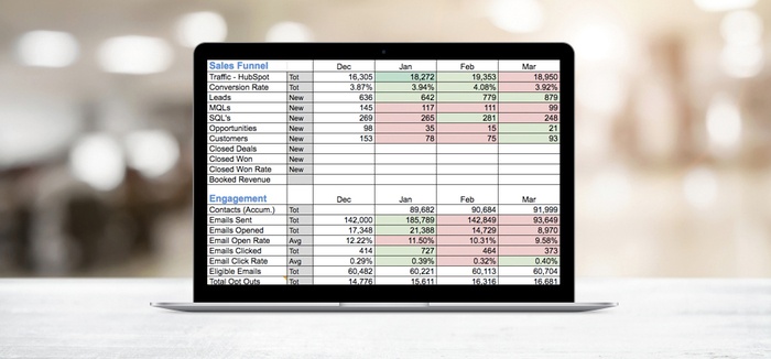 Our scorecards are effective ways to summarize monthly results and make comparisons month-over-month. We wanted to improve on them by adding more visual displays and by streamlining preparation of reports. Databox allows us to add those improvements by:
By experimenting with these new tools, we began to develop a wishlist for our reporting needs. We also had the opportunity to help shape the tools by providing suggestions to the Databox team during the beta, and many of our suggestions were incorporated. From our wishlist, we tried different combinations, graphs and layouts for data visualization, and that led us to our seven key use cases.
One of the most important jobs of a sales and marketing professional is to identify trends or disruptions in the data that require both explanation and remedy. A simple use case is to look at blog traffic compared to last month.
The waterfall display below from HubSpot data shows a 31 percent increase in blog views compared to last month, and on the right a combination bar/line chart from HubSpot and Google Analytics data shows that the blog consistently drives approximately 50 percent of all website page views. A marketer could conclude that new blog posts were effective in driving a significant increase in traffic, and that there were no large daily spikes, indicating that no one blog post dominated the data.
A second use case involves monitoring progress toward one or more goals. Here we are monitoring sales performance versus quarterly goals for revenue, percentage of closed won deals and the status of the sales pipeline deal stages. This gives a sales manager an instant indication of overall performance and could lead to specific actions to achieve goals, such as focusing the team on deal creation or realizing they need to diagnose why a large number of deals are stuck in negotiation.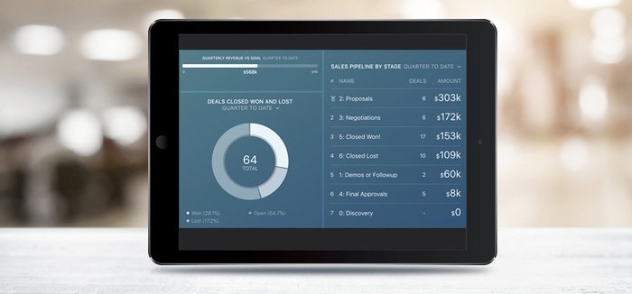
An informed sales manager is an effective sales manager. In this use case, a sales manager wants to know when significant deals are added to the sales pipeline by sales reps. As new deals are added, a notification is sent by email to the sales manager, who can then examine the new deals more closely in the CRM and have a chat with the sales reps working the deals to help close them.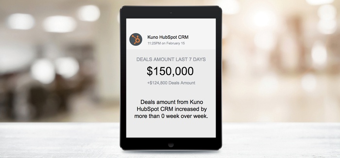
Let’s say you want to evaluate your marketing channels, including website, SEM, social media, email marketing, content referrals and direct traffic. It would be nice to be able to aggregate data from the different tools you use and create visual displays to help you compare results from the different channels over the same time period.
Here we have collected website page views (Google Analytics), Facebook page views (Facebook), visits and contacts by source (HubSpot) and keyword performance (Google AdWords) into a single display that gives a marketer a quick look at the overall effectiveness of each channel in the last 30 days. In this case you might conclude that the Facebook channel is inconsistent on a daily basis, and you might want to investigate the spikes—what post or posts drove the traffic on those days and how can you get the same performance every day?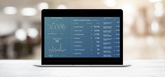
The data and displays you get by default out of marketing automation or CRM systems may not exactly fit your needs. Let’s say you want to evaluate your email marketing performance over the past month, and you want to look at a variety of calculations, like email send-to-open, open-to-click and send-to-click ratios, in addition to the raw email performance data. Here you can see we have made those calculations directly in the visual display, and they are automatically updated as the data is collected and as different time intervals are chosen.
In this case, we have also included charts showing the email response rates as each email was sent over the past month, and you can see that the one batch email (the big spike in the emails sent graph) had lower relative open and click rates compared to the other emails that were more targeted and sent to smaller groups. In this visual, we also assess the indirect impact of email response on blog performance, landing page conversion and movement of leads into MQL and SQL lifecycle stages.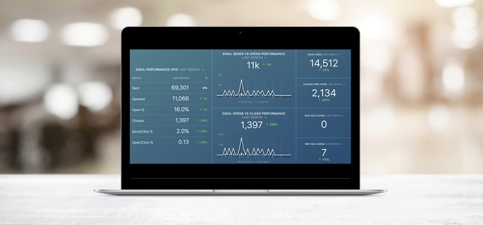
Since we live in a mobile world, it’s essential to have access to critical data anywhere, anytime. Sales and marketing people are no exception. Sales managers and reps need mobile access to their CRM when they are in the field, traveling or participating in remote meetings. Marketers need daily and weekly summaries of their KPIs in order to make agile adjustments to campaigns to optimize results.
Here is an example of a marketing summary I get every day. It lets me know at a glance where we are with respect to sales and marketing goals and how our current KPIs compare to last month. If one or more metrics appear to be flagging, I can make decisions on how to turn them around quickly without waiting to be in my office or in a monthly meeting.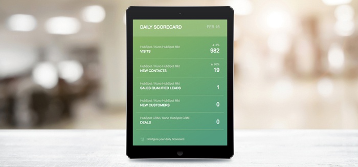
As an inbound marketing agency, we have teams assigned to our client accounts. Each account manager or inbound marketing consultant can be on several accounts, and they have responsibility for the success of each their accounts. Part of that responsibility is monitoring sales and marketing KPIs on a daily, weekly and monthly basis in order to stay on track toward achieving client goals.
Using Databox, we can combine information summaries from multiple accounts in one visual display. This enables our teams to view a single snapshot of results from all of their assigned accounts at once and assess priorities for actions they need to take to meet their objectives.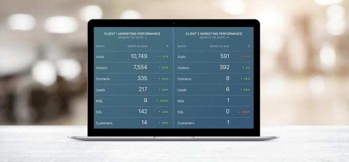 Our beta test with Databox has opened our eyes to the need for a variety of visual displays from diverse datasets on both desktop and mobile devices. Using Databox, we can compile views that help us streamline reporting and at the same time provide better insights for our customers.
We can also better stay on top of our results and achieve client goals in a more agile way than ever before. We expect these tools to enhance profitability through a more efficient data collection and reporting process, and at the same time to add value for our customers through enhanced analysis and strategic review.